Enhance Food Presentation with Strategic Use of Colors
What Impact Do Primary Colors Have on the Appeal of Meals?
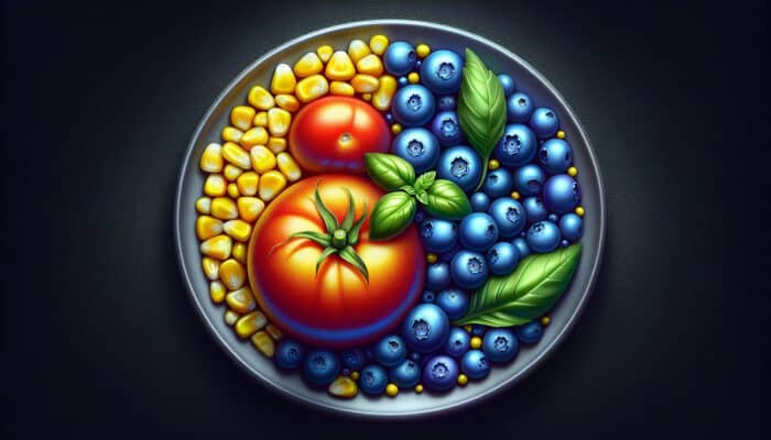
Primary colors—namely red, blue, and yellow—serve as the fundamental elements that capture the visual attraction of a dish. When used strategically, these colors can significantly elevate the overall aesthetic of meals, stimulating the senses and making the food more enticing. For example, a bright red tomato set against the lush green of basil creates an eye-catching contrast, while the sunny yellow of corn adds a touch of warmth and vibrancy. This combination results in a plate that not only excites the palate but also encourages consumption.
An iconic illustration of this principle is the Caprese salad, where the vibrant mix of red tomatoes, creamy white mozzarella, and bright green basil not only forms a visual feast but also stirs emotions, enticing diners to relish their meal. By artfully integrating these primary colors, chefs can craft gorgeous presentations that leave a memorable impression on their guests.
How Can You Explore Complementary Color Pairings in Food?
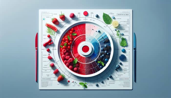
Complementary colors are those that lie opposite each other on the color wheel, creating a visually captivating and harmonious balance. For instance, pairing a vivid orange with a deep blue or a rich red with a fresh green can enhance the visual appeal of food, making it more attractive to the viewer. To incorporate these color pairs into your everyday meals, consider serving bright orange carrots alongside a crisp green spinach salad or pairing blue corn tortilla chips with a zesty red salsa for an exciting experience.
When selecting complementary color pairs, it is crucial to focus on the intensity of the colors to maintain visual harmony. A striking orange pumpkin presented on a deep blue plate creates a bold contrast that draws the diner's attention to the dish. Experimenting with these combinations can transform a simple meal into an artistic presentation that delights both the eyes and the taste buds.
How Can You Balance Warm and Cool Tones for a More Engaging Plate?
Mixing warm and cool tones effectively can create a visually engaging experience on a plate. Warm colors like reds, oranges, and yellows exude energy and excitement, while cool tones such as blues and greens introduce a sense of calm and relaxation. For an effective presentation, consider a dish of roasted red peppers paired with a refreshing green arugula salad; this not only whets the appetite but also maintains a visually appealing contrast.
To achieve the perfect balance, think about using warm colors as accents against a cooler background. For example, a vibrant orange butternut squash soup garnished with fresh green herbs creates a striking visual contrast that is both inviting and aesthetically pleasing. Thoughtfully incorporating these tones into your meals can elevate your culinary creations, making them more engaging and enjoyable for diners.
How Do Colors Affect Appetite and Eating Habits?
Can Color Intensity Influence Eating Behavior?
Indeed, the intensity of colors plays a vital role in shaping eating behaviors. Bright, vibrant shades often encourage more enthusiastic consumption and excitement about the food, while softer, muted tones can lead to moderation. For example, a bright yellow banana is often perceived as more appealing than its duller counterparts, leading to increased consumption. This principle can be effectively applied to meal presentations; a plate adorned with vivid, saturated colors is more likely to stimulate appetite than one featuring subdued hues.
To leverage this effect, consider using lively ingredients such as red bell peppers or deep green spinach in your dishes. These bold colors not only entice diners but also create an impression of freshness and richness. By selecting ingredients based on their vivid intensity, you can craft meals that are not only visually appealing but also encourage diners to indulge.
What Key Factors Should You Consider When Choosing Colors for Food Presentation?
Multiple key factors influence the selection of colors in food presentation, including hue saturation, brightness, and contrast. Saturated hues tend to attract the eye and stimulate appetite, while softer shades may convey sophistication and restraint. For instance, a dish featuring rich burgundy beetroot against light beige quinoa provides visual interest while maintaining a balanced aesthetic. This contrast significantly enhances the overall appeal of the meal.
When selecting colors, aim for a balance in saturation and brightness. Highly saturated colors can serve as focal points on the plate, guiding the diner's attention to specific elements. By implementing these principles, you can create dishes that not only taste fantastic but also look visually stunning and enticing.
How Does Color Psychology Influence Food Plating?
Color psychology significantly influences how food is perceived and enjoyed. Different colors evoke various emotions—red can stimulate appetite, while blue can suppress it. Gaining insight into these psychological effects allows chefs and home cooks to craft appealing arrangements that resonate with diners. A well-plated dish can dramatically enhance the overall dining experience, making it memorable and enjoyable.
- Enhances appetite stimulation
- Evokes emotional responses
- Creates visual interest
- Aids in food recognition
- Increases meal satisfaction
- Encourages healthy eating
By applying these psychological insights to your plating techniques, you can create meals that not only look impressive but also engage diners' emotions, enhancing their overall experience and satisfaction.
Professional Insights on the Best Color Combinations for Food
What Advanced Techniques Can Be Employed for Vibrant Color Pairings?
Creating vibrant pairings necessitates a solid understanding of color theory and a keen eye for detail. One advanced technique is to layer colors thoughtfully to guide the eye across the dish. For example, you might start with a base of vibrant greens, layer in bright orange carrots, and finish with deep purple beetroot. This layering approach adds depth and creates a visual journey for the diner.
Another effective strategy is to incorporate textures alongside colors. A crispy golden-brown roast chicken paired with a rich green herb sauce not only plays with color but also contrasts textures, enriching the overall eating experience. Mastering these techniques enables you to elevate your dishes to an artistic level, impressing diners with both flavor and presentation.
Why Do Certain Color Combinations Shine in Food Design?
Some color combinations naturally stand out due to their contrasting properties and their ability to create harmony on a plate. For instance, the classic pairing of green and red not only pleases the eye but also signals freshness and health. This synergy renders such combinations irresistible and memorable.
Furthermore, current trends in food presentation often favor bold contrasts, such as serving colorful food on stark white plates. This design strategy highlights the meal and positions it as the focal point of the dining experience, encouraging diners to engage with their food both visually and gastronomically.
How Can You Integrate Colors for Optimal Food Presentation Results?
To achieve optimal results in food presentation, it is essential to integrate colors seamlessly. Begin by selecting a primary color as the foundation of your dish, then build around it with complementary and accent colors. For instance, consider adorning a bowl of spaghetti with bright green basil, fiery red chili flakes, and a sprinkle of white cheese, creating a visually appealing and harmonious dish.
Be mindful of the proportions of each color used. An overwhelming amount of one hue can detract from the plate's overall appeal, while a balanced blend creates an inviting scene that draws diners in. By taking the time to thoughtfully blend colors, you ensure that every plate is a feast for both the eyes and the palate.
What Expert Tips Are Available for Seasonal Color Combinations?
Adapting color combinations to the seasons not only enhances aesthetics but also connects meals to the freshness of seasonal ingredients. For example, during spring, vibrant greens and yellows can dominate, reflecting the freshness of asparagus and peas. In autumn, warm oranges, browns, and reds can highlight the richness of pumpkin and squash. Using colors that echo the seasonal landscape creates a connection between your dish and nature.
Renowned chefs often recommend using seasonal produce to inspire color choices. Incorporating fresh, local ingredients not only ensures a vibrant palette but also enhances flavor profiles. By aligning your color choices with the seasons, you can create meals that are not only visually appealing but also reflective of the best that nature has to offer.
What Characteristics Make a Color Combination Appealing and Appetizing?
How Can You Achieve Visual Harmony on Plates?
Visual harmony in plating can be achieved through thoughtful color selection and arrangement. Begin by using a limited color palette, concentrating on two or three complementary colors that work well together. This method prevents overwhelming the diner and fosters a cohesive look. For instance, a dish featuring grilled salmon, garnished with vibrant green asparagus and a splash of lemon yellow, creates an inviting and harmonious presentation.
Additionally, consider the placement of each color on the plate. Arranging colors in a way that naturally guides the eye through the dish enhances visual interest. Effectively utilizing negative space can also contribute to harmony, allowing each color to shine without competing for attention.
What Are the Essential Elements of Attractive Color Use?
Several core aspects contribute to the appeal of color use in food presentation, including contrast, variety, and balance. Contrast helps highlight different elements of the dish, drawing attention to specific ingredients. For instance, a bright green pesto drizzled over a rich red tomato sauce creates a striking visual contrast that is both appealing and appetizing.
Incorporating variety through the use of different textures and colors also enhances the overall presentation. A plate adorned with varied colors and shapes captivates diners, inviting them to explore each element. By focusing on these essential aspects, you can create visually stunning dishes that are sure to impress and satisfy.
How Can You Test Different Approaches to Color Combinations?
Refining color choices in your presentations is an ongoing process that benefits from experimentation. Testing various color combinations allows you to discover which pairings resonate best with your taste and your audience's preferences. Consider preparing several iterations of a dish with different color schemes, then gathering feedback from friends or family to identify the most visually appealing options.
Additionally, pay attention to how the colors interact with the flavors and textures of the food. A combination that looks great on the plate may not taste as good if the flavors clash. By testing different approaches and making adjustments based on feedback, you can ensure your color choices are not only visually appealing but also enhance the overall dining experience.
Research-Supported Advantages of Thoughtful Color Combinations
What Key Benefits Arise from Thoughtful Color Choices?
Thoughtful color choices provide numerous benefits, including enhanced perception and enjoyment of meals. Research indicates that visually appealing food can significantly improve the dining experience, leading to higher satisfaction levels. For example, studies have shown that participants rated meals more highly when colors were chosen with care, emphasizing that presentation is as crucial as taste.
Real-world examples abound in the culinary industry, where top restaurants invest in beautiful presentations to elevate the dining experience. By focusing on color, chefs create memorable experiences that keep diners returning for more, enhancing their overall enjoyment and satisfaction.
How Do Color Combinations Boost Nutritional Appeal?
The nutritional appeal of a meal can be significantly enhanced through mindful color combinations. Bright colors often signal freshness and health benefits, encouraging diners to choose healthier options. For instance, a salad featuring a rainbow of colors—red tomatoes, orange carrots, green kale, and purple cabbage—not only looks enticing but also suggests a rich variety of nutrients.
Research reveals that the perception of healthiness increases with the vibrancy of a dish. This connection between color and health can guide diners in making better dietary choices, underscoring the importance of color in promoting nutritious eating habits.
What Are the Long-term Effects of Effective Color Combinations on Meal Enjoyment?
Utilizing effective color combinations can yield sustained benefits in meal enjoyment. When diners consistently experience visually appealing meals, it fosters a greater appreciation for food and dining occasions. This ongoing engagement encourages more adventurous eating, broadening palates and enhancing enjoyment over time.
- Engage with color-focused recipes
- Experiment with seasonal ingredients
- Incorporate variety in meal presentations
- Gather feedback on visual appeal
By applying these principles and making a conscious effort to enhance visual appeal, you can create lasting positive associations with meals, transforming dining into a more enjoyable experience overall.
How Do Thoughtful Color Combinations Affect Health Outcomes?
Thoughtfully selected color combinations can lead to improved health outcomes, particularly by encouraging increased vegetable intake. Research indicates that meals presenting a variety of colors tend to attract more attention and interest, leading to greater consumption of healthy ingredients. For instance, a dish featuring a colorful mix of vegetables can inspire diners to embrace healthier options.
- Incorporate vibrant vegetables into meals
- Utilize seasonal produce for freshness
- Experiment with contrasting colors
- Encourage family meals with colorful presentations
Applying these findings to everyday dietary choices not only enhances meal enjoyment but also contributes to overall wellbeing. By focusing on color as a key element in meal preparation, you can positively influence eating habits and promote healthier lifestyles.
How Can You Implement Color Combinations in Daily Meals?
What Simple Strategies Can You Use to Experiment with Hues?
Experimenting with hues in daily meals can be an enjoyable and rewarding endeavor. Start by dedicating one meal each week to exploring a specific color scheme. For instance, you might choose a day to incorporate various shades of green into your meals by adding ingredients like avocado, spinach, and green peppers. This approach not only diversifies your meals but also enhances their visual attractiveness.
Consider utilizing garnishes to add a splash of color. A sprinkle of fresh herbs or edible flowers can dramatically transform a plate, introducing vibrant bursts of color and elevating the overall presentation. By making small adjustments and experimenting with different hues, you can enrich your culinary repertoire and inspire creativity in everyday cooking.
How Can You Create a Color Palette for Everyday Dishes?
Building a versatile color palette for everyday meals can simplify meal preparation while enhancing visual appeal. Start by selecting a few key colors that you enjoy and that are readily available in your local market. For instance, if you choose vibrant reds, greens, and yellows, you can easily incorporate these colors into a variety of dishes.
Additionally, consider creating a visual guide for your palette, noting which ingredients pair well together. This guide can serve as a quick reference for meal planning, ensuring you consistently create vibrant and visually appealing plates. Over time, this practice can elevate your cooking, making meals not only more attractive but also more satisfying and enjoyable.
What Strategies Can Help Maintain Consistency in Presentations?
Consistency in presentations is crucial for keeping meals engaging over time. Establish a standard for how you plate your dishes, focusing on color schemes and arrangements that resonate with your style. For example, you might choose to use a white plate as your base to showcase vibrant colors, ensuring that each dish stands out visually.
Regularly revisiting your color strategies can also help maintain interest. Try rotating your color combinations based on the seasons or what’s available in your local market. This approach keeps your meals fresh and exciting, ensuring that diners remain engaged and intrigued by your culinary creations.
Frequently Asked Questions About Color Use in Food Presentation
What Are the Most Effective Colors for Food Presentation?
The most effective colors for food presentation include vibrant hues like red, green, and yellow, as they stimulate appetite and enhance visual appeal. Utilizing contrasting colors also helps create balance and attract attention, making the dish more inviting.
How Do Colors Influence Appetite?
Colors can significantly influence appetite; brighter, more vibrant colors tend to stimulate eating, while muted tones may encourage moderation. This psychological effect can be strategically utilized in meal presentations to promote consumption and enjoyment.
What Are Complementary Colors in Food?
Complementary colors are hues that are opposite each other on the color wheel. In food, examples include green and red or purple and yellow, which create visual harmony and enhance the overall attractiveness of dishes.
Can Color Combinations Affect Health Perception?
Yes, color combinations can impact health perception. Bright, varied colors in a meal often signal freshness and nutritional value, encouraging diners to choose healthier options and enjoy their meals more fully.
What Are Some Easy Ways to Experiment with Food Colors?
Begin by focusing on one color scheme each week, using ingredients that fit within that palette. Utilize garnishes, explore seasonal produce, and try different plating techniques to enhance visual appeal and make meals more exciting.
How Can I Develop a Color Palette for My Meals?
Select a few key colors you enjoy and that are available in your local market. Create a guide of which ingredients pair well together to simplify meal planning and ensure visually appealing dishes every time.
What Role Does Color Psychology Play in Food Presentation?
Color psychology significantly influences emotions and perceptions. Understanding how different colors affect mood can help you create meals that not only look good but also resonate emotionally with diners, enhancing their overall experience.
How Can I Maintain Consistency in My Food Presentations?
Establish a standard for plating and consistently use a specific base, like a particular color plate. Rotate your color combinations seasonally to keep meals fresh and engaging while adhering to your established presentation style.
What Are the Benefits of Using Vibrant Colors in Meals?
Using vibrant colors in meals enhances visual appeal, stimulates appetite, and can signify freshness and health benefits. This contributes to an overall positive dining experience, making meals more enjoyable and satisfying for diners.
How Can I Apply Color Theory in My Everyday Cooking?
Incorporate color theory by selecting complementary and contrasting colors when plating. Experiment with various shades and hues to create visual balance and interest, ensuring your meals are both aesthetically pleasing and delicious.
Connect with us on Facebook!
The post Best Color Combos for Appetizing Plates: Key Ideas appeared first on https://cookinggods.com


No responses yet